
Apple Motion is a great tool for motion graphics and compositing with an incredibly powerful and adaptable toolset and I keep coming back to it as one of the fastest ways of getting great-looking results. For certain kinds of jobs it's many times quicker than Adobe After Effects, as I demonstrate in this video. Motion doesn't have the range and depth of After Effects, of course, but for the right job, it's the perfect tool, and it's great fun to use as well as easy to learn.
In this ongoing series of tutorials, I hope I can help you discover more of what Motion can do. I'm assuming that you have a decent basic knowledge of how Motion actually works. If you're looking to get started in Motion I highly recommend Mark Spencer's outstanding Motion tutorials at Ripple Training.
These tutorials are not tailored for the novice user, but if you follow along carefully you might be able to get by. What I wanted to do here is to showcase a wide range of project-based tutorials to help you move up the the next level and get more out of Motion.
In addition to some awesome title treatments, you'll discover some cool motion graphics elements, particle effects, in-depth scene compositing, real world visual effects, music visualisers, and loads more. There are also videos that examine different technical aspects of Motion, as well as some projects where we look at creating title and transition effects for use in FCP X. So there's a lot for you to explore.
And with 33,500 subscribers to date (and growing at nearly 10% every month), it seems a lot of you are liking them. Here are just a few of your most recent comments:
The things a creative person can do with a mere $50 app. --- I'd just like to thank you for the truly superb tutorials on your channel - they're undoubtedly the finest on YouTube, or anywhere else for that matter. --- I've watched thousands of tutorials but your tutorials are miles ahead. --- Awesome stuff! --- Absolutely brilliant! --- Jaw on floor, once again! --- SO cool. --- Wow! the stuff you manage to make looks incredible. --- HOLY MAC AND CHEESE. --- Damn! I think I just peed myself ... !
A very popular tutorial based on an original concept by Andrew Kramer, showing how to create "realistic" rain on glass. Download the background image and glass texture here.
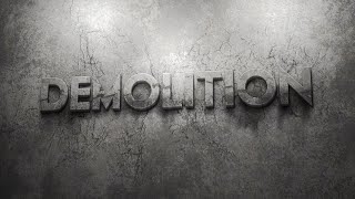
Smash, destroy, demolish - we all love a bit of random destruction. Lots of interesting techniques to discover in this tutorial that go way beyond what you will usually see for this effect. The logo disintegrates from the wall complete with "3D" falling chunks, which are what really contribute to the overall realism. You can download the assets here
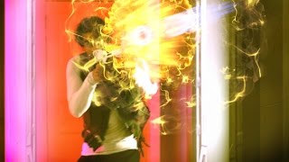
A two-part sci-fi gun blast tutorial, based on the original concept by Andrew Kramer, with shockwave, displacement and a lot more. Tutorial renders here. Part Two here.
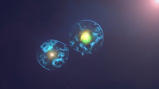
I don't know if it's scientifically accurate but I think it looks pretty nice - the cell division process visualised using only the Apple Motion toolset. The fun part is creating the "sucking" effect of the two cells clinging together as they divide, but there are also plenty of tips on creating an interesting look to the scene.
One of the things you can't do in Motion is camera projection, at least not with an actual camera, but this set of three tutorials show you how to cheat it very effectively and simply. There are a lot of uses for this technique which is widely employed in top end visual effects - but you can also use it just to give life to your stills.
The method shown in Part One isn't going to work in all cases (this is quite a simple example) so make sure you check out Part Two that shows a more advanced technique which will give great results on all images. Many thanks to Allan Subert for the sample image.You can download this image here.
And in Part Three we'll be looking at building a 3D object from a flat still image - plus a bonus feature looking at a volumetric lighting technique. Tutorial image download.
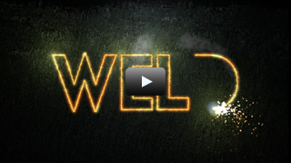
This is a consistently popular tutorial, probably because it involves an element of pyrotechnics which always goes down well.
The two-part tutorial shows you how to create a "photorealistic" welding effect that cuts letters out of a sheet of metal, complete with sparks and smoke and other good stuff. Hopefully there are many useful tricks you can pick up from following along with this one.
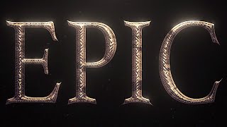
Some really useful and interesting techniques for creating a fake 3D title treatment with dramatic depth, texture, reflections, staining and other details that goes way beyond what you can achieve with the 3D Title Tool, and which works well with any graphic object.
Please check out the brief follow-up here which fixes a simple problem.
Download the assets here.
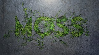
Discover how to create this effect of moss growing out of cracks in a wall to fill in a text or graphic. Inspiration for this (as so often) comes from Andrew Kramer at videocopilot.net.
Assets download.
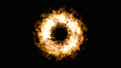
Loosely based on one of Andrew Kramer's amazing After Effects tutorials, this one shows you how the build an impressive-looking explosive shockwave.
The two-part tutorial shows off a few interesting techniques you may not know about - and there's some fun compositing to do at the end where you can really let rip with your own interpretation of the effect.
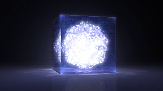
A two-part tutorial showing how to create a 3D "tesseract" cube effect created using only the built-in Motion tools, including refraction effect and glowing core. Download texture map. Part Two available here.
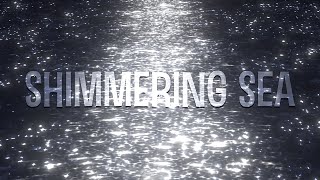
Some very useful techniques for creating the effect of a shimmering, sparkling ocean. Lots of scope to customise this effect and create different looking water surfaces.

Using the Text Sequence behavior to help automate static text styling - some interesting tricks you might now know about.
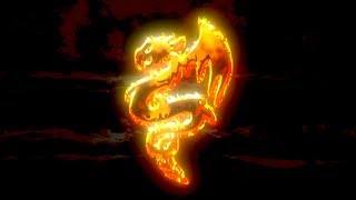
An interesting technique for creating fire for use with motion graphics. Lots of scope for you to use these methods to create your own unique and dramatic looks. Download Project with embedded artwork image here.
With Halloween just around the corner, here's a spooky tutorial that looks at creating a sinister gothic graphic complete with rust, decay and stylised nightmarish cobwebs. Plenty of useful techniques here that you can adapt for use at other times of the year too! Download the assets.
A basic beginner's introductory tutorial explaining the use of Clones, when to use them, how to use them, and how to harness their exceptional power.
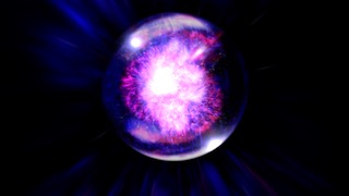
Create this energy filled 3D sphere entirely in Motion. Part Two looks at the dramatic fly-through that completes the scene. (With acknowledgements to Andrew Kramer, as so often, for the original design concept.)
A technique for quickly and easily slicing up an image into multiple slices and animating the result. A variant on a commonly used concept. Apologies if you have seen this already a hundred times (I haven't watched every Motion tutorial ever published to check how many users have already landed on this trick) ... a few of you may be new to the concept.
IMPORTANT NOTE: Make sure your display is set to read Frames and not Timecode otherwise you might end up miscalculating the numbers for this effect to work correctly.
A tutorial that shows how to create a laser effect to cut out a logo or text object - with an in-depth explanation of how to use the bezier tool to create custom paths.
A simple tutorial to show off a popular Harry Potter style particle effect. This is not one of my usual epic tutorials with a definite end product - I just wanted to clarify the technique you might use to achieve this effect.
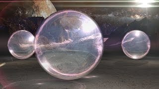
Create this interesting sci-fi scene with fake 3D crystal spheres, including refraction, reflection, specular highlights, caustics, shadows and a lot more. Download the project texture files here
Discover how to create this moody light art scene. A number of useful tricks in this project including how to create an ambient occlusion effect and textured specular highlights.
Note that this design works a lot better with much taller letters than I have used here because it exaggerates the light art effect as well as the light hitting the floor and ceiling, as in this example.
Download the project and image files here.

Create this popular long shadow effect simply and effectively in Motion 5. Apply any sequence text for a cool animated result.
In this three-part series we'll look at three different techniques for creating a Vegas slot-machine machine effect. Here's Part One. And you can find Part Two here.
In Part Three we'll cover a quick tip for a slightly easier-to-use Replicator technique for this project.
Create this clean and simple title template for FCP X and sharpen up your Motion skills - learn how to combine image masks and a bunch of other useful tricks.
Create this dramatic 3D scene and discover how to create photorealistic reflections that will really take your projects to a different dimension.

I covered some of this in my Rain on Glass tutorial but here's a more in depth look at how to create water displacement effects, with some useful background theory on how to work with Fixed Resolution. Discover how to use the Glass Distortion and Bump Map filters correctly without running into tricky problems.
Very simple tutorial for creating a clean, modern title effect and publishing it to FCP X, with some useful tricks along the way.
WARNING: There's an Apple bug that affects the color linking in this project and which will cause you problems. Please be sure to watch the follow-up here, which offers a different solution that should avoid any problems with this. And we'll also also look at how to build this effect without keyframes and hence access more control over the published animation.
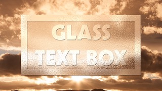
Create this frosted glass title effect for use in FCP X. Nothing hugely fancy but a set of standard tricks you should find useful. And if you just want to download the Title effect you can find it here.
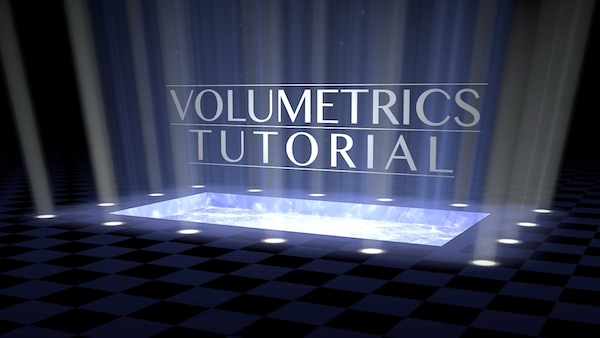
In this new tutorial we look at creating realistic 3D volumetric lighting in Motion to create a dramatic display title.
Volumetrics in a 2.5D application like Motion is a bit of a cheat but this one works very well allowing you to move around the light rays in any direction.
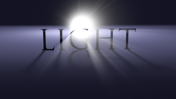
Based on a ingenious concept by Andrew Kramer for After Effects, this tutorial looks at a different way of creating volumetric light rays that again interact correctly with the camera.
Some useful tips on using behaviors to create fancy expression-type parenting links.
Make sure you check out my other volumetric lighting tutorial. And for an even more interesting approach have a look at my volumetric fog tutorial.
Tutorial showing some simple but useful techniques for creating a "word cloud" type effect. For more information on using the File Text Generator, see here.
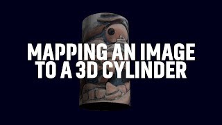
An explanation of the concept and maths behind mapping an image to a 3D cylinder. Hopefully once you've understood how the numbers work you will be able to adapt this method to your own requirements.

Why it's best not to use the Cmd+Shift+G shortcut to make a new group from your selected layers and how to get around this. (Note this shortcut is the same as selecting "Group" from the Object menu - both will give you the exact same problem.)
Based on an After Effects tutorial by Andrew Kramer, this is a cool, modern-looking ">motion graphics project that has lots of potential uses and is easily customisable.
Create this frequency-sensitive music visualizer in Motion. Download the project file here.
New two-part Music Visualizer tutorial featuring a host of interesting techniques, useful even if music visualizers aren't your thing! You can find Part Two here.
And you'll discover different visualiser projects here and here.
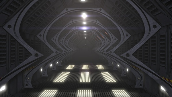
I'm always interested to see how much 3D one can get out of Motion given that it's only a 2.5D application, so here's a major construction project that shows some useful tricks for building a complex 3D environment.
This is a very long 3-part tutorial that runs to nearly 90 minutes, so you'll need a lot of patience to get through it, but I hope it's worth it for the many techniques on display. Links for Part Two and Part Three.
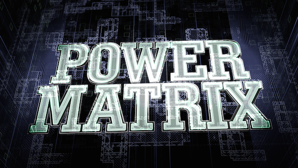
Create this complex electrical power grid title sequence. Lots of interesting tips and tricks here, including complex animated texture creation and organic mattes.
Watch part two here.
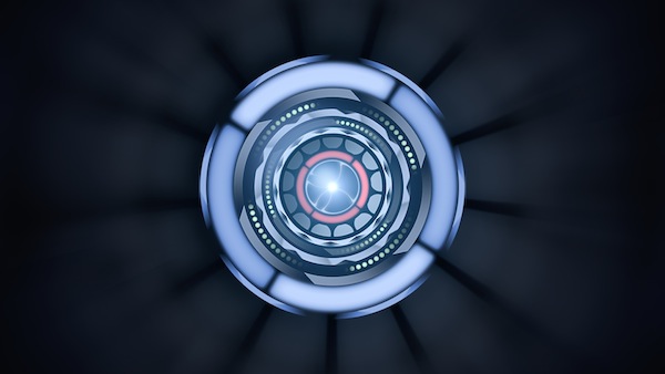
Another tribute to the creative brilliance of Andrew Kramer, this tutorial shows you how to create a complex sci-fi instrument - spinning dials, flashing lights, cool effects.
Even if you don't want to make a sci-fi instrument (and why should you?), there's still a lot that's useful here.
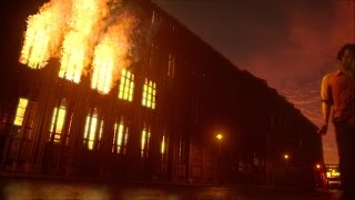
Compositing a scene with procedural fire created using only Motion's built-in tools. Useful techniques for when you need fire to fit particular elements in a scene and behave in a user-controllable fashion, which is not always possible with photographic fire elements.
Footage kindly shot and supplied by Sebastian Matthias Weissbach. Check out his Cinéma Fatale channel.
Download the footage here.
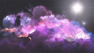
Create this complex-looking nebula scene entirely in Motion 5 using simple compositing techniques for optimum performance. Lots of useful techniques here that should help you create complex projects of your own. Part 2 available here: Part Three here.
More volumetric fun and games, this time creating the effect of fog with 3D depth and parallax. This is a useful companion tutorial to "Volumetric Lighting - A Different Look".
Note that although this tutorial shows how to create this effect with a text object, you could also use it to get great-looking results with a live action image such as a window or a door.
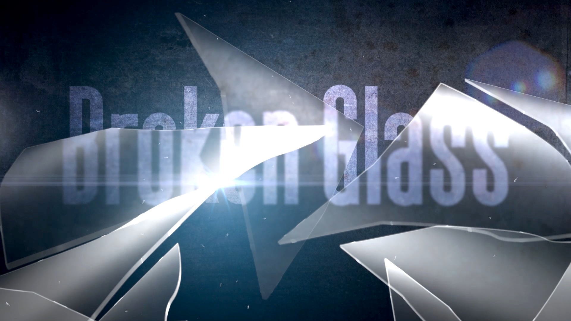
I was watching a very popular recent After Effects tutorial that showed off a technique for making a two-dimensional "glass" shard and thought there has to be a way of doing it in Motion that gives a much better result, is much more efficient and is much quicker to render - and it turns out there is.
Create this glass shatter effect with faux-3D depth, specular edge highlights and refraction. OK, so it's not rocket science, it's not true 3D but it's quite a useful set of techniques that I hope you'll find interesting.
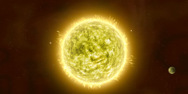
Create this complex space scene in Motion 5 using only the built-in tools featuring lots of really interesting techniques that you may not know about for creating fiery textures and elements.
For those who want to skip straight to the fun compositing stuff in Part Two, here's a download link to the pre-rendered elements from Part One.
I started watching a tutorial for After Effects to create an effect similar to this one.
The first thing the tutorial mentioned was that you needed to go out and buy several hundred dollars worth of third party plug-ins (the usual suspects!) to create the effect. I stopped watching at that point and wondered what it would take to do the same thing in Motion with no third party help, and here's the resulting tutorial.
In addition to showing you how to make the particle systems from scratch there's also a useful tip for creating your own custom lens flare.
Part Two available here.
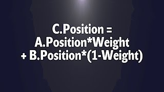
It's commonly thought that you can't do expressions in Motion - this tutorial shows you how that just isn't true with a useful expression that has many applications.
Tutorial for this curious "particular" effect - not sure what it's meant to be but it's quite interesting and a lot of you asked to see how it was done.
Here we will be creating a classic "split-flap" depature board graphic animation.
The cool thing about this project is that, although the animation is surprisingly complex, once you've done the work of setting it up, you'll find it really easy to change the text any time you want. A good lesson in being organised from the start!
And make sure you check out this alternative method which gives a different end result.
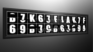
Discover a whole new way of creating a departure board (otherwise know as a Solari board) with multiple "flaps" for an impressively realistic effect - some very useful techniques here that you might not know about.
Compare an alternative version of this concept here.

A simple dot matrix display project that creates a nice dramatic, photorealistic look. Download the free dirty glass texture here.
The "glitch" effect is one that is really popular right now - rather ironically since the death of tape and analogue TV means glitches are mostly a thing of the past in the real world. But they can still make for a dramatic and stylish look.
Here's a tutorial to show you how to create several different glitch effects from scratch without the use of third-party plug-ins.
In this tutorial we'll be making the title sequence background featured in the Glitch tutorial, which involves creating stylised text and a planet using powerful and flexible procedural techniques.
No Photoshop or library images are involved (with the exception of the starfield background). All the textures and effects are created using the built-in Motion toolset.
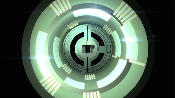
Three different techniques for creating 3D cylinders or tubes. There are probably others - I only remembered the third one immediately after publishing the first version of this guide! The second option is a really strange but very effective trick that you're very unlikely to have come across and it offers some really interesting creative possibilities.
Modern digital heart rate monitors in hospitals don't look anything like the ones we're used to in films and on TV, but the old analogue look is a lot more visually interesting which explains its enduring appeal.
This tutorial shows you how to recreate this classic effect.
You often hear that Motion can't do the stuff that After Effects can do, so this was an attempt to recreate an After Effects tutorial by the great Andrew Kramer at videocopilot.net.
It shows you how to create a really cool effect of text materialising behind textured glass. The interesting part of this for me was working out the different techniques required to achieve the effect in Motion and discovering that in some cases Motion could do the job more efficiently not less!
Another particle-based tutorial, this one shows you how the create the effect of two light trails chasing each other across the screen.
Note that there's one tricky issue with this effect and that's the way that particle emitters function in Motion - because they don't use sub-frame sampling for their position, you get "kinks" in the motion path if you move them too fast. The solution is to either slow down the animation (which you may not want to do), or slow it down and make it twice as long, the re-import it and speed it back up again. Please let Apple know that this limitation bugs you!
In which we look at a simple technique that has limitless possibilities for adding interest to your motion graphics with loads of tricks to help you get more out of Motion.
Discover how to create great-looking "Photoshop-style" bevel effects using just the built-in tools in Motion 5. Perfect for publishing to Final Cut Pro X.
This tutorial emerged out of my attempts to try and create more or less plausible-looking fire using particle systems with procedurally-animated cells and then applying that to a text object.
You may find the end result less than completely convincing but you may be able to use the advanced technique I devised here to do something better. There's definitely something in it so over to you to turn into something great!
Around the end of December here in the UK, I thought it would be fun to do something around the theme of ice and snow. This tutorial shows you how to make a complex 3D-style title that crystallises out of an icy blast.
Plenty of interesting tips and tricks involved in this project so it's well worth a watch. Wrap up warm first, though!
This tutorial was one I made to help out a user wanting to create "photorealistic" particles in Motion.
It shows you how to create a mass of dust-like particles floating in a beam of light and is a good introduction to creating advanced particle effects in Motion for when you want to move beyond the rather clunky and unnconvicing presets that Apple have built into the library.
Some useful and interesting techniques to brush up on in this project around the theme of digital data.
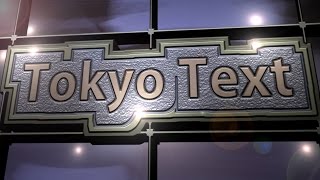
A simple text-based project that shows off some useful techniques that you might not know about.
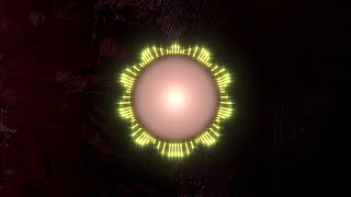
Tutorial showing how to build a circular music visualizer with plenty of interesting hints and tips on using Motion more effectively.
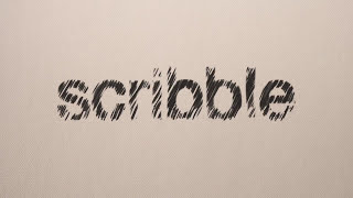
How to create a scribble effect in Motion 5. Easy enough to do in After Effects with the built in filter but here are some techniques you can use to get pretty close with Motion.